Michael Zajac
Web design and photo vr
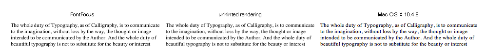
Comparison of OS X font hinting with samples from the FontFocus white paper.
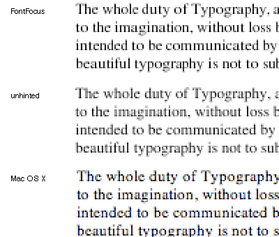
Comparison of three rendering styles: FontFocus, unhinted rendering, and Mac OS X rendering, in 11-pixel Times. OS X samples were created with subpixel smoothing on an LCD screen, and won’t look right if viewed on a different display.
The same rendering, at 200% enlargement.
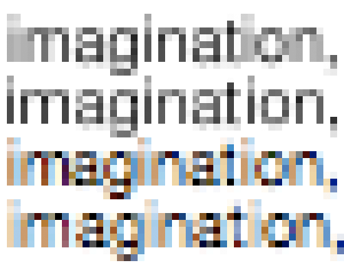
‘Imagination,’ in 9-px Helvetica, rendered ‘without any hints or grid-fitting but with subpixel accuracy (similar to rendering in Mac OS X),’ and in FontFocus. The last two samples are actually rendered in Mac OS X, in Helvetica and Helvetica Neue fonts. Examples reduced to 100%, and 1,000%.
![]()
Source for the unhinted and FontFocus renderings is http://artofcode.com/fontfocus/. Mac OS X renderings were created using Apple’s TextEdit.app 1.4 (220) on Mac OS X 10.4.9 build 8P2137, with default settings in the Appearance system preference: font smoothing style ‘Automatic – best for main display’ and ‘Turn off text smoothing for font sizes 8 and smaller.’
To my eyes, the Times sample is clearest and best-looking in the OS X rendering. ‘Imagination’ looks sharpest in the FontFocus rendering, although, if it matters at this tiny size, the font hinting has distorted the font to give it a noticeably larger x-height.
© Michael Zajac 2007